Title Research and Design-Jess Smith
2. Shutter Island
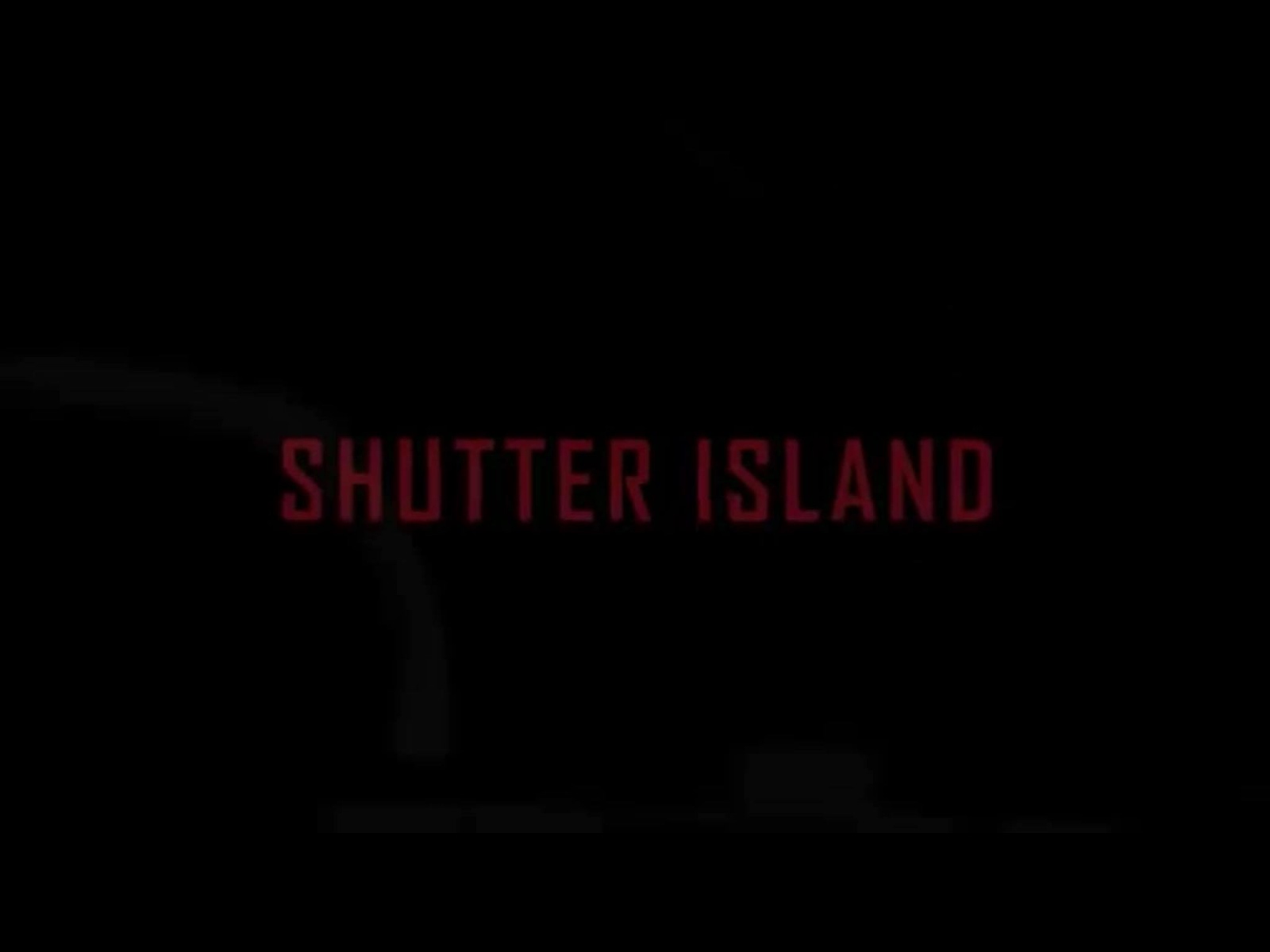
~Throughout this title sequence it suggests that the films genre by the use of colour, such as the dark red text on the black background which connote danger, blood and a sense of evil (figure 1 and 2). They have the red against a black background which makes it stand out well. However this is the only obvious symbolization that this is a thriller film which is quite unusual for a title sequence. But because of this it will create interest for the target audience as they don't have much information, creating an enigma.
 |
| F1 |
 |
| F2 |
~The film title is a very simple, plain design (figure 1). The font is all in capital letters which could suggests this thriller will be shocking and sharp in action, which typical for this genre. They've used a medium sized font which doesn't cover a lot of the fully black screen. However there is an animation of the title after a few seconds of it being shown on the screen when it suddenly zooms into the 'R' at a very fast pace which gives this sequence an edge and makes it a more thrilling feeling for the audience. Also because the dark reds that connote death, danger and blood is on top of the fully black (also connoting danger, darkness and a fear of the unknown) background it gave watchers the sense of anxiety and that this film was definitely a thriller.
~The sequence includes the institutional information of who the film was by (figure 3), the producers (figure 4), the director (figure 5), the name of the author of the novel the film was based on (figure 6), the director of photography (figure 7), the editor (figure 8) and finally who did the music (figure 9). By including all of these names in the sequence it gives the audience a wider scope of knowledge of the film. Each name is either written in a dark red or in white with a range of moving images as backgrounds. The text was designed in a certain way to stutter as it was displayed, creating an inconsistency.
 |
| F3 |
 |
| F4 |
 |
| F5 |
 |
| F6 |
 |
| F7 |
 |
| F8 |
 |
| F9 |
 |
| F10 |
~There is no indication in the title sequence of the time period or specific date. Although there is a shot of a grand, gated brick entrance to a large English, Victorian styled manor house (figure 10) which could mean it's set in an older time period. Due to the green, leafy trees and cloudy white sky it would further indicate this part of the film is set in England but nothing is confirmed.
 |
| F11 |
~The 3 main actors names were included in the sequence which was done to prove that certain well known actors were starring in it, such as Leonardo DiCaprio (figure 11). By only showing 3 names ensures the audience won't get bored of seeing loads of names at the beginning. Each name is written in capital letter in the same skinny, narrow, white text and appears with a soft fade. It works well against the dark backgrounds.
~Overall the relationship between the backgrounds for the title and credits is good because the text is always placed on a dark part of the frame, therefore the text colour and name stands out. It is effective for a thriller opening because it's still giving the important information but without ruining the moving image behind.
~The moving image begins as soon as the sequence starts and the credits are placed on top straight away. however the title of the film isn't presented until the very end of the sequence. I believe they ordered it this way to build up the suspense and anticipation for the target audience, which worked well on me.


Some very good examples here of placement when you superimpose over the actual film.
ReplyDelete